Freshen Your Look for the New Year with Pattern Mixing

Pattern mixing: it’s a simple thing to do! You either have one pillow with a fantastic pattern or you don’t. If you do, keep that one and work from it. If you don’t, take the pillows you have and chuck them. You might find you’ll be able to go back and use those to augment what you have but don’t work from them initially. That’s not the way to go.
Here’s what you do: find a new pillow that is fantastic, gorgeous, absolutely perfectly what you want (if you don’t know what you want, send me some pictures and I’ll tell you which one you want!). It has to be a real eye catcher. Don’t worry about whether or not it matches your current room decor. What you do have to worry about is whether or not it has pizzazz!
Now what?
You want to establish your ground color or main color. Whatever it is, give it a name for your reference. Then establish what color is used the most after that ground color, and so on. These are the colors you’ll work with to mix up your pillows:
MIX PATTERNS WITH SOLIDS
An easy thing to do is to mix a pattern with solids. You can easily find solids that will coordinate with any given pattern.
PATTERN PIZAZZ
But if you really want to have fun with patterns, you should mix multiple patterns together. This technique is a little more complicated. Here are some steps to follow:
1. Mix two or three different patterns, but with fewer colors.
—You want each pillow to be equally as strong as the original, making sure that each pattern is distinct. The idea is to have patterns that are similar but not alike. Varied patterns, like stripes with plaids with paisleys with polka dots with florals with multi-stripes...there are so many ways to go!

2. Evaluate the scale of your patterns.
—Refer back to your knock-it-out-of-the-park pillow. Is it a large pattern? Is it extra large, midsize, small, tiny? Once you know the scale of your pattern, pick other patterns that are of different scale but similar color palette.
Let’s look at some examples:
FOYER VIGNETTE
For instance, take a look at this picture. The first pattern I loved was the geometric, which I put on the cushion seat. Then I started finding other patterns that could work with it. When I came across that stripe, I liked it a lot because it was bold and strong - similar colors - but I still didn’t have the explosive accent pattern...until I came across the little applique three-dimensional floral gem! This is called a conversational pillow (because it’s something that invites conversation!).
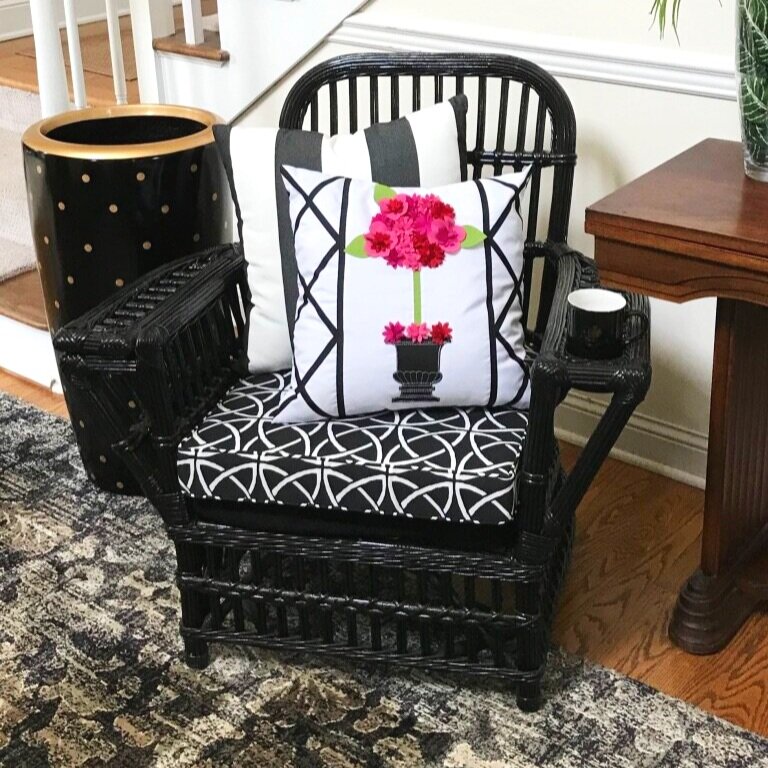
It is darling and has a geometric pattern down either side. That became my accent. Take note, the conversational is not scaled. It is framed by a geometric. I was able to eliminate all the other pillows and just keep the stripe, and now I had what I needed.
So let’s look at this more closely:
Evaluate the basic colors - a black chair with a super high gloss.
Identify the starting place - a mid-sized geometric cushion.
Add a large scale stripe.
Floor has an extra large damask pattern on the rug.
Start with something so strong that it could pop among all these other patterns.
And I got lucky - it absolutely pops and is just perfect!
LIVING ROOM SEATING
Here is another great example. This client had a wonderful, good quality, gray linen sofa and didn’t want to give that up, but really wanted a home that was warmer and toned. And yet, she loved neutrals. So we had great time mixing patterns.

The black and white is a pagoda conversational. Then, we identified a woven B&W chevron and a geometric Greek key pattern in a trim. We also have a solid that we mixed with the enlarged houndstooth on a pair of beautiful channel-backed chairs. And finally we added leopard print for more neutral color. We also have the pattern of the rug and yet another geometric pattern on the drapes at play, mixing several different scales of patterns while keeping everything tonally even and warming up the space.
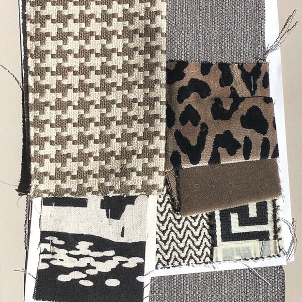
The paint choices were important here, too. We have Sherwin Williams’ “Poised Taupe” (SW6039) - in a flat - for the walls, and Sherwin Williams’ “Incredible White” (SW7028 ) - in a semi-gloss - for all the trim, mantle, baseboards, and windows. The ceiling is a flat version of exactly the same white which helps lift it even higher for a lovely effect.
LIBRARY
With this client we had a more extensive color palette to work with. We had the wall color, the camelback patterned sofa, and take a look at the spectacular embroidered conversational silk pillow! A stunner we were happy to work with!
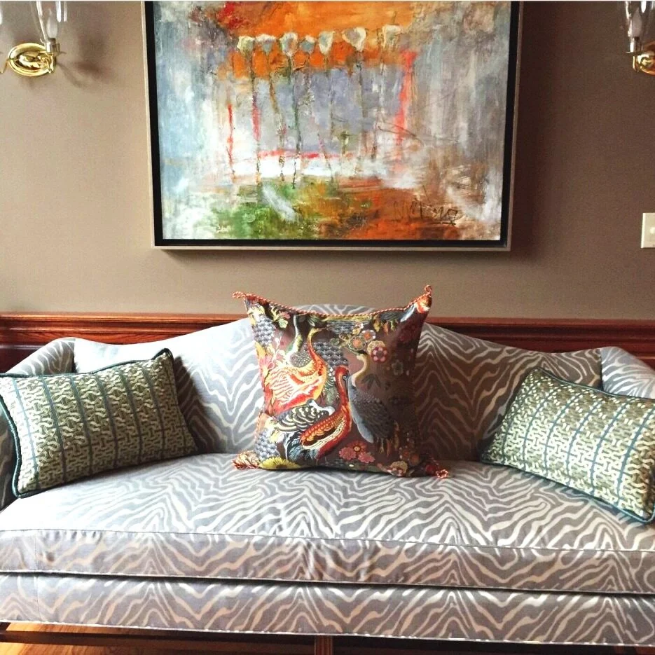
We needed to mix pillows to update the other existing furniture. So we evaluated the colors that were in the pillow. Next, I went on a hunt and found all the different, complementary patterns. They are all woven: bright orange, large scale geometric (tone on tone), small scale animal print (tone on tone), the solid, and the gorgeous teal-embroidered-with-gold-thread smaller geometric. The animal print gives interesting tone on tone texture, the solid gives the eye a place to rest, and the embroidered teal gives a spectacular geometric in stripes.

In the library, we added yet another pattern - an animal print. We used that fantastic texture as our neutral on the sofa which, along with our paint choice, gives everything else room to pop. Especially the fantastic work of art, which is an abstract that lives in direct contrast to the specificity of all the other patterns we’ve been working with. It doesn’t get better than that, does it?! The human eye is drawn to that painting against the darker neutral wall and then drops down into the specificity and uniqueness of this incredible interpretation of peacocks with florals. It is a fantastic pillow.
When I say find a spectacular pillow you love, this is what I’m talking about. It’s going to cost you, but it’s so worth it.
Want to take this wisdom with you next time you’re looking at pillows? Grab my cheat sheet for pattern mixing below! Click the button to gain access.